Evaluation and Reflection, Moodle 4, Pedagogy, Technologies

Designing Assessment Pages that Works for Students: What UX Research Told Us

Overview

Assessment is one of the most high-stakes parts of a student’s learning experience. Yet the way assessment information is presented on KEATS has until now been largely left to individual modules, leading to inconsistency, confusion and unnecessary friction at the moments students can least afford it. 

This article presents the case for a redesigned Assessment Template for KEATS, drawing on user research with King’s students and following the design process from Discovery through to Delivery. It aims to provide a practical, evidence-based rationale for the template and support colleagues in considering its adoption within their own modules. 

What the research told us 

The need to redesign the KEATS Assessment section emerged from UX research into students’ experiences of navigating module pages. During the interviews with thirty King’s students, assessment-related tasks consistently surfaced as the most significant pain point. Common challenges included:  

Findability of assessment is the biggest blocker. Students frequently encounter assessment details spread across multiple locations (pages, documents, links). This makes it difficult to build a clear understanding of requirements, deadlines, and expectations. 

Submission is not clearly signposted. Students often struggle to confidently identify where to submit, even when they find the relevant section. Submission links can feel hidden, out of place, or insufficiently emphasised. Not visually distinct is a common complaint when assessment submission links look like any other blue link.  

Label and heading ambiguity create risk. Participants repeatedly mentioned heading and naming confusion, such as multiple similarly named links. Ambiguous titles (i.e. January submission) drive errors, especially close to deadlines. 

Overload from dense or excessive assessment content. Assessment briefs, guidance documents, and submission links are often presented at the same visual level resulting in poor hierarchy between information, submission, and supporting materials. 

Uncertainty around deadlines, weighting, and requirements. Critical information such as deadlines or formats is not sufficiently highlighted or standardised and thus students express confusion about deadlines or what exactly needs to be submitted. 

Grades and feedback are not always easy to locate. While it wasn’t a primary focus of the user research, a few students mentioned that they struggle to find where grades are released in a timely manner. 

The research not only highlighted the challenging aspects of navigating assessment but also provided a clear direction for improvement. Students consistently expressed a need for an assessment section that follows a consistent and predictable structure, is easy to scan, and presents key information clearly without overwhelming them with dense text. 

Why we’re doing this 

The goal of the Assessment Template is simple: students should always know where to find what they need, regardless of which module they’re on. This reinforces the need for a consistent and predictable assessment experience, with a single, trusted location where students can easily access key information, understand requirements, and complete submissions without searching multiple areas in the module. The template provides this structure, while still allowing academic teams to customise the content within it. 

How we got here: solution discovery 

I explored a range of real assessment scenarios to ensure the template was grounded in actual module needs, not just a theoretical ideal. Four use cases shaped the design 1. Coursework only 2. Remote online exam 3. Coursework + remote online exam 4. Coursework + online exam in person. This helped defined the right design opportunities: 

– How might we give students a single, trusted starting point where they can immediately understand all assessment requirements and deadlines?  

– How might we ensure the submission area is placed where students expect it, reducing confusion and last-minute submission stress?  

– How might we make assessment pages easy to scan, so students can locate what they need in seconds?  

Two design directions emerged from this wireframing process. Both had the same content; the key difference was where submission links were placed. In Design A, submission links appeared inline within each assessment section. In Design B, they were consolidated into a dedicated ‘Submission area’ at the bottom of the assessment section. We put both to testing. 

Usability testing 

An unmoderated usability testing was conducted using Maze (a user research and testing tool) to compare the two assessment page designs. The testing aimed to assess students’ experience of the assessment section as a whole, rather than focusing solely on any one component. A total of 37 participants took part across the two design variants, comprising both King’s students and members of the public. 

Including public participants alongside King’s students allowed us to compare the experience of users familiar with university learning environments against those encountering it for the first time, helping identify design patterns that were intuitive regardless of prior experience. 

Screenshot of the heatmap interaction for the assessment section in Maze.

Key takeaways 

Page structure and headings were validated. The assessment summary table providing an overview of all assessments, types, weightings, due dates, and feedback timelines received an ease-of-use rating above 4.0 out of 5. The ‘General guidance’ section was also well received, with the majority of participants reporting it contained ‘just enough’ information which means not too sparse nor too overwhelming. 

The submission-flow results strongly favoured Design A. Across all participants, submission links were located 23.9% faster and users reported 20% greater confidence when submission links were embedded within their associated assessments, compared to when they were grouped into a separate area. This was the clearest and most consistent finding across the testing. 

Students hold a clear mental model: an assessment is one unit. The brief, the resources, and the submission link belong together. The template honours this expectation by keeping these elements together, making the page easier to scan and the submission journey more confident at the moment it matters most. Separating these elements created a mental disconnect that led users to search in multiple places before finding what they needed. 

Looking ahead 

For now, implementing the template is still a manual process, requiring academic teams to work through guidance and replace placeholder content directly within the page. While straightforward, it does require some familiarity with KEATS. 

Looking further ahead, we have plans to work with our developers to make this process significantly more automated and intuitive, feeding in information from tools like CourseLoop and SITS. This structured approach would reduce the risk of misconfigured pages, make the template easier to adopt for less confident KEATS users, and make consistency the default outcome rather than something that requires additional effort. 

When students know where to look, they spend less time navigating and more time on what matters. A consistent, well-structured assessment section is not a small UX improvement. It is a scalable intervention in the student assessment experience that reduces uncertainty and supports student success across modules. 

If you are interested in implementing the new Assessment section on your KEATS Module, please do reach out to your Faculty Digital Education team or DigiEd directly. 

About the author 

Madison Wang is a Product Designer at King’s Digital, collaborating with Digital Education agile teams to improve the KEATS experience for staff and students. Part of the UX team, specialising in end-to-end design and translating user research and insights into practical, evidence-based solutions. 

Evaluation and Reflection, Moodle 4, Pedagogy, Technologies

Redesigning KEATS

Leading with UX: How we reimagined KEATS for 2025

KEATS, King’s College London’s virtual learning environment, plays a central role in teaching and learning across the institution. While it undergoes regular technical updates – such as Moodle version upgrades, security patches, and minor interface adjustment – recent years have seen a growing emphasis on improving its visual design and alignment with the King’s brand. 

The release of Moodle 4 in 2023 provided an opportunity to refresh the platform’s interface, resulting in a cleaner, more modern look and a stronger visual identity. However, due to the scale of the redesign and tight delivery timelines, there was limited scope for user involvement or data validation during that phase. 

By 2025, with a more established visual identity in place, the focus shifted toward enhancing the user experience (UX) for students and staff. This phase prioritised functionality, usability, and user-centred improvements – moving beyond aesthetics to ensure the platform better supports everyday use. 

A UX-led approach (on a tight deadline)

At the request of Digital Education, the UX team at King’s Digital led a six-week initiative to plan, test, and implement meaningful changes to KEATS. The approach was lean, data-informed, and highly collaborative. 

The team conducted a rapid discovery phase, drawing on: 

  • Findings from previous usability testing 
  • Results from the System Usability Scale (SUS) survey 
  • Informal interviews with students and staff 

These insights highlighted key areas where small, targeted improvements could significantly enhance the user experience. 

Cross-functional UX workshops brought together designers, researchers, developers, and stakeholders to: 

  • Prioritise changes based on impact and feasibility 
  • Clarify the rationale behind each proposed improvement 
  • Define a realistic scope for a one-month delivery window 

What we changed (and why it mattered)

Here’s what we delivered and how user feedback shaped every decision. 

1. Top Menu:clarity through card sorting 

Challenge: Students reported difficulty locating key information, and the top menu occupied excessive screen space when scrolling. 

Screenshot of old layout of top menu.

Solution: A card-sorting exercise informed a redesigned top menu with clearer labels, reduced height, and improved responsiveness. The result is a more intuitive navigation experience that enhances content discoverability. 

Screenshot of updated layout of top menu.

2. Dashboard: prioritising key tasks 

Challenge: Usage data revealed that the dashboard experience lacked clarity and focus, with several competing elements diluting its effectiveness. In particular, the Timeline feature – especially important on mobile – was under-emphasised and not as accessible as it could be. 

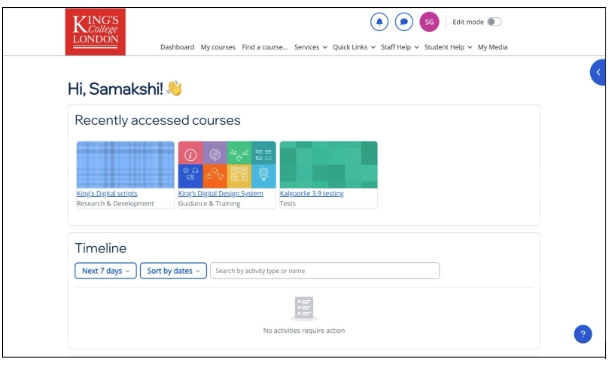
Screenshot of KEATS homepage prior to timeline usage optimisation.

Solution: Through three design iterations, the dashboard was simplified, the Timeline was elevated in prominence, and visual hierarchy was improved. These changes support a more task-focused experience for students. 

Screenshot of KEATS homepage with timeline usage optimisation.

3. Custom Section course format: consistency for focus

Challenge: Inconsistent course formats and reliance on unsupported plug-ins created usability and maintenance challenges. 

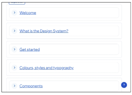
Screenshot of Custom Sections format prior to being restyled to align with institutional design guideline.

Solution: The Moodle-native Custom Sections format was restyled to align with institutional design guidelines. This enables consistent use across KEATS, supporting a more cohesive and accessible learning experience. 

Screenshot of Custom Sections format restyled to align with institutional design guideline.

The Impact 

Despite the ambitious timeline, the initiative delivered measurable improvements: 

  • Positive sentiment quadrupled in usability testing 
  • 100% of students in guerrilla testing rated the new dashboard as “good” or “excellent” 
  • Users described the platform as “cleaner,” “more modern,” and “easier to navigate,” particularly on mobile devices 

These enhancements, while incremental, had a meaningful impact on the overall user experience. 

Looking ahead

This project laid the groundwork for a longer-term UX strategy for KEATS. A dedicated Product Designer has now joined the team to embed user-centred design practices into ongoing development. Continuous iteration, informed by regular feedback, will guide future improvements. 

The next SUS survey will provide further insights into user needs and preferences. Staff and students are encouraged to participate and help shape the future of KEATS. 

Final thoughts 

KEATS 2025 represents more than a visual update – it marks a shift toward proactive, user-led development. By prioritising usability and aligning design with real user needs, King’s is taking meaningful steps toward delivering a better digital learning experience. 

🙋‍♀️ Want to chat more about UX in education or share your KEATS experience?

Our next Coffee & UX ☕ event is on 6th November (9am to 12pm), and we’re inviting both presenters and participants of the wider community to join us at King’s. If you’re interested in UX in Education — whether to share, learn, or just chat over coffee — we’d love to see you there.

More information and sign-up can be found at this website.

About the author

Juliana Matos

Juliana Matos, UX Manager at King’s College London | Experienced LXer | Bridging academia, education, and industry through thoughtful, data-driven, human-centred UX strategy.

Pedagogy, Technologies

Reframing AI in Higher Education: From Hype to Practice at King’s Foundations

Introduction

Artificial Intelligence (AI) is no longer just a hot topic it’s a reality rapidly shaping how we design, deliver, and reflect on education. While discussions around AI are increasingly open and active across King’s College London, the pace and tone within King’s Foundations has been more reserved.

As a Learning Technologist working in King’s Foundations, I recently attended the Association for Learning Technology’s (ALT) OER25 Open Education Conference. This experience sharpened my perspective on how AI, particularly generative AI can be critically and constructively embedded across not just assessment and feedback, but curriculum design, staff development, and internal communication. The key? Moving beyond automation and embracing openness, collaboration, and shared ownership.

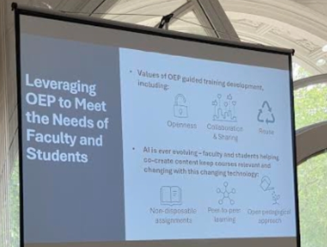
Image of slides from Open Education on Meeting the needs of faculty and students.
Image taken from the OER25 conference.

Artificial Intelligence

At OER25, one of the most recurring themes was that AI reveals not resolves, the tensions already embedded in our educational systems. A speaker from the AI Now Institute urged participants to ask not how much AI we can use, but how little computational power we need to retain meaningful educational practice. This principle, dubbed “frugal computing,” flips the narrative from efficiency to intentionality.

AI generated image around AI in education. It has a robot and human working together.

This resonates deeply with our current challenge in King’s Foundations. While there have been informal discussions around AI mostly centred on resource development, assessment redesign, and feedback workflows conversations often occur in silos. During the conference, examples from other institutions showed that siloed experimentation without shared resources or policy scaffolding often leads to duplication, inconsistency, and missed opportunities.

Many departments at King’s (outside of Foundations) are engaging in visible pilots such as AI-supported assessment banks, ethical guidelines, even student training hubs. But internally, staff across King’s Foundations may only hear about innovations from other teams through casual conversations or ad hoc meetings. This presents a major gap: not just in practice, but in strategic alignment.

Lessons learnt

1. AI Should Be Seen as a Shared Resource, Not a Specialist Tool

From feedback generation to curriculum scaffolding and even budgeting, AI has potential across a broad spectrum of educational activity. The open MOOC (Massive Open Online Course) case study from Politecnico di Milano highlighted how modular, editable resources shared across departments helped create consistent student experience while reducing duplication of effort.  King’s Foundations has the potential to lead in creating a shared AI resource hub supporting consistency, reducing duplication, and promoting inclusive, informed digital practice across teams.

2. AI Can Reduce Feedback Inequality but Only with Transparent Practice

The OER25 sessions addressed hidden labour and opacity in AI use. For King’s Foundations, AI-generated feedback could help reduce marking load and give students quicker responses. But unless these systems are transparent, explained, and ethically disclosed, students may distrust them, or staff may avoid using them.

There’s also an opportunity to explore shared, open banks of feedback phrases and models making formative feedback not just fast, but open and peer reviewed. This would also facilitate more aligned feedback standards across King’s Foundations courses, helping reduce the “black box” nature of academic comments.

3. Internal Communication is as Important as Innovation

One standout comment at the conference came from a digital education researcher who said:

“Most departments don’t need new AI tools they need shared language and shared direction.”

King’s Foundations has a strong culture of innovation but often lacks systematic ways of sharing outcomes and learnings. AI pilot projects such as using co-pilot agents for formative feedback, AI summarisation of reading packs, or tools like Explainpaper for decoding complex texts and Perplexity for guided research should be openly documented, evaluated, and scaled. A regular ‘AI in Practice’ forum could promote transparency and reflect the open sharing ethos reinforced at OER25.

4. Open Educational Practices (OEP) Must Include AI Transparency

The conference raised deep concerns around AI disrupting knowledge equity. From data scraping of open archives to the invisible labour of data labellers, generative AI often operates in ethically grey spaces. For King’s Foundations has a unique opportunity to lead by embedding discussions of AI literacy, openness, and creative commons licensing into our professional development and curriculum.

By modelling these practices internally, For King’s Foundations can support not only better teaching but clearer communication, values alignment, and trust-building with students and staff alike.

The way forward

To move forward, AI must be treated not as a technical upgrade, but as a cultural shift that demands openness, reflection, and collective action.

AI generated image showing the evolution of people learning from books then moving to technology to learn.

Recommendations

  • Create a shared digital repository of AI-assisted tools, templates, feedback prompts, and ethical use cases across KF that are easily accessible and clearly communicated to all staff. Ensure that resources are well-organised, regularly updated, and supported by clear guidance on how to access them, who to contact for further information, and where to go for training or troubleshooting. This will help eliminate confusion, raise awareness, and promote confident, consistent use across teams.
  • Facilitate regular cross-departmental check-ins (e.g. AI in Practice sessions) to surface, connect, and align AI-related initiatives.
  • Pilot AI feedback enhancements in a transparent, student-informed way, ideally within formative assessment stages first.
  • Develop a King’s Foundations-wide AI policy primer, aligned with King’s broader policies, including OER and open pedagogy principles.

There is an opportunity not only to align with the wider college conversation on AI, but to help shape it through critical practice, grounded experimentation, and visible collaboration.

Useful Links

About the author

Faith Namakula, Learning Technologist at King’s Foundations with a sharp focus on digital transformation, AI-enhanced education, and strategic innovation in assessment and feedback. Faith specialises in bridging technology and pedagogy, enabling data-informed, compliant, and effective digital practices that align with King’s strategic priorities. With expertise in project delivery, stakeholder engagement, and digital capability development, she is committed to embedding sustainable, high-impact solutions that contribute to institutional excellence and sector-leading practice.

Accessibility, Evaluation and Reflection, News and Events, Pedagogy, Technologies

Coffee & UX ☕, brewing change in higher education

Designing better learning experiences – one cup at a time.

User Experience, or UX, can make or break an online product. Ever tried tapping a tiny button to add an event to your calendar, only to blame the size of your finger and, in frustration, end up messaging your partner to remind you instead? You’re not alone. Giving up on your calendar perfectly illustrates the statistics: according a report by RMG Digital, 90% of users will leave a website because of poor design. And you’ll be glad to hear that this experience doesn’t just frustrate users – it also hurts businesses. In fact, according to the same report, 70% of online businesses fail due to bad UX.

While UX might seem like a hot topic today, its principles have been around for over 30 years, though they are often misunderstood or misapplied. The term itself was coined in the 1990s by Don Norman, one of the founders of the influential Nielsen Norman Group, to describe everything a person feels and experiences when interacting with a product or service.

As the Nielsen Norman Group explains:

The first requirement for an exemplary user experience is to meet the exact needs of the customer, without fuss or bother. Next comes simplicity and elegance that produce products that are a joy to own, a joy to use. True user experience goes far beyond giving customers what they say they want, or providing checklist features. View the Nielsen Group article.

Simply put, when UX is done well, it feels almost invisible, helping people get what they need without frustration or hassle. When it’s done badly… it’s very noticeable.

UX for EdTech presents a particular problem. The stakes are quite different – it’s not just about user-friendly tools, or a nice interface, but about creating meaningful learning experiences that truly support students throughout a transformative educational  journey. Without strong design and UX, even the most innovative and academically sound educational technology can fall flat – and that can be a real problem when students are already facing the (enormous!) cognitive challenge of learning something new. Providing these great experiences means going beyond usability to include engagement, motivation, and effective learning outcomes – a broader approach often encompassed by the term ‘LX’.

While commercial providers of educational technology have been grappling with UX for some time, with varying degrees of success, in higher education, UX is still a relatively new concept, with its own set of challenges. The rapidly changing world, evolving digital experiences, growing competition, and rising student expectations all add layers of complexity. Combine that with academic rigour, complex systems, and diverse student needs, and designing genuinely student-centred experiences becomes a real balancing act.

I was aware of these challenges as I stepped into the role of UX Manager at King’s, yet undeterred. Coming from a background in teaching and private EdTech, I saw this role as a chance to bring everything I’d learned into a new environment with its own rhythms, ecosystems, and rewards. And it’s been great to see my team bridge that gap hosting events such as UXDX, as well as by participating in MUGGL and ALT M25.

That said, some challenges here at KCL still felt strangely familiar, only on a much larger scale. In the higher education sector, silo mentality inhibits communication between institutions but often within them too, leaving departments keen to find opportunities yet uncertain of how and where to share insights or best practices. It quickly became clear to me that although incredible work was happening across the organisation and within the wider EdTech industry, its full impact was held back by a lack of connection and collaboration. What was missing was a dedicated space to focus specifically on UX for EdTech – which is exactly why KCL’s Coffee & UX ☕ began.

KCL’s Coffee & UX ☕ is a simple idea with a clear purpose: to connect, create a community of practice, spark conversation, and bring a bit of change into how we think about and design for students. It’s much more than a platform to showcase our work; it’s a welcoming space that encourages open conversation, shared learning, and collaboration, helping the incredible work happening across the organisation reach its full potential.

The premise is simple: once a quarter, we gather on a King’s campus in central London for a couple of hours, with coffee and snacks. Each team shares what they’ve been working on, and together we explore the tools, methods, and approaches shaping our work. We discuss research findings, share challenges and wins, and exchange best practices. It’s also a chance to get to know each other, build connections across departments, and spark ideas for improving the student experience – whether that involves digital learning tools, physical spaces, workflows, or blended experiences that bridge both.

So far, we’ve held two meetings: one in spring and one in summer. From the very first session, it was clear we had something special – the excitement and positive feedback were overwhelming. Teams connected, shared ideas, discussed best practices, and explored ways to collaborate. The conversation didn’t end there; our group chat continued buzzing with reflections, questions, and action points, showing just how engaged everyone was. It was a real sign that Coffee & UX ☕ was creating a space people value and want to keep building.

The summer edition, held on 10th July, was another great success, with over 10 attendees from King’s Digital’s UX team and Quality Assurance Officers; Libraries & Collections; Digital Humanities; IT; and Student Knowledge Info & Enquiries. With a sharper focus this time, teams shared specific projects sparked by our first meeting, such as the assessment templates research and the development of a research repository. We also explored new topics, including databases in PowerBI, card sorting exercises to organise the VLE’s top menu, accessibility research, and inspiring examples of how libraries are pushing UX further to meet students where they are. It was truly inspiring to see such a diverse range of work underway and to feel the strong passion for enhancing the student experience across King’s. To close, and as a testament to how valuable we’ve found these meetings so far, we discussed opportunities to enhance our ongoing efforts to build a real community, including a proposed calendar of activities moving forward.

So, what’s next for KCL’s Coffee & UX ☕? Our goal is to open the door wider – to welcome more teams from across King’s to share, collaborate, and tackle the unique challenges we face together. We also want to expand our circle by inviting colleagues from other universities to join the conversation, sparking fresh ideas and new partnerships. Ultimately, we’re aiming to bridge gaps – within our institution, between universities, and between higher education and the EdTech private sector, building a vibrant, connected community that drives real, positive change for students.

Do any of these challenges or ideas resonate with you? Have you tried something similar in your institution or organisation? Maybe you’ve faced similar hurdles in your own institution, or you’re simply curious about how we’re shaping the User Experience landscape in Higher Education and want to get involved? Whether you’re interested in sharing your experiences, asking questions, or just having a friendly chat about UX and the student experience, I’d love to hear from you. Let’s connect, learn from each other; and maybe explore how we can make a real difference together… over a cup of coffee?

Our next event is on 6th November, and we’re inviting both presenters and participants of the wider community to join us at King’s. If you’re interested in UX in Education -whether to share, learn, or just chat over coffee – we’d love to see you there.

Sign up and learn more

About you the author

Juliana Matos

Juliana Matos, UX Manager at King’s College London | Experienced LXer | Bridging academia, education, and industry through thoughtful, data-driven, human-centred UX strategy.

Accessibility, Pedagogy, Technologies

DigAcc25: A Day of Digital Accessibility at King’s

Introduction 

DigAcc25 is a digital accessibility conference that brings together professionals from across the UK Higher Education sector. Since its launch in 2023, the University of Nottingham has hosted DigAcc annually. This year’s event took a distributed approach where institutions were encouraged to host local events. 

We joined in the fun at King’s College London and I organised a local event where we could watch the conference together. On 25 June 2025, around 30 colleagues from across King’s (including teams from Digital Education, IT, and EDI) came together at Waterloo campus for a day dedicated to digital accessibility. Colleagues may or may not have been influenced by the promise of pastries and lunch…! Thank you to Brickfield Education Labs for supplying some freebies for the day, including digital accessibility cubes (pictured later). Each side featured a handy reminder for tips on improving accessibility.

A classroom setting with several people seated and facing a large screen at the front of the room. The screen displays a presentation titled "Digital Accessibility 2025" with an image of people walking on a street. The attendees are sitting in rows of chairs.
A classroom of people attending Digital Accessibility 2025 in person.

Why bring DigAcc25 to King’s 

Whilst King’s doesn’t yet have a dedicated digital accessibility team, there are many colleagues and teams doing great work in their own areas. What’s currently missing is a space to bring those efforts together, which what I hoped DigAcc25 would help kickstart. 

In my role as a faculty Technology Enhanced Learning Manager, I have been advocating for digital accessibility in my faculty. This includes raising awareness through empathyfocused activities, delivering training for both academic and professional services staff, and carrying out audits on our virtual learning environment (VLE). When undertaking accessibility work, it is not unusual to feel isolated without a wider network to exchange ideas or seek advice. Hosting a local DigAcc25 event was a way to bring people together, start conversations, and hopefully bring about changes! 

A pyramid of six cube-shaped boxes, each labelled with a category of digital accessibility tips: "Media Tips," "Layout Tips," "Text Tips," "Image Tips," "Table Tips," and "Link Tips." Each box lists three practical tips related to its category. A red "King's College London" staff lanyard is visible at the bottom of the image.
Digital accessibility cubes provided by Brickfield.

Lunchtime networking 

Although we were working within the structure of the DigAcc programme, I made space for a King’s-only lunchtime session by shortening the scheduled 1 hour 40 minute lunch break. Potentially a risky move, but one that I think paid off! With nourishment provided by King’s Food, colleagues remained fuelled up!  

The lunchtime session featured five quick-fire presentations and gave a flavour of what colleagues across King’s are working on: 

  • I kicked things off with a quick overview of the work the Technology Enhanced Learning (TEL) team has been doing in The Dickson Poon School of Law, and posed a question to the room about the European Accessibility Act, which came into force on 28 June 2025.  
  • Fiona Strawbridge (Director of Digital Education) set the scene on where digital accessibility currently stands at King’s and encouraged everyone to share ideas from the day. 
  • Alistair McWiggan (Curriculum and Digital Innovation) gave a demo of the work he’s doing to create accessible courses and resources on the distance learning programmes and mobile-responsiveness for the Institute of Psychiatry, Psychology & Neuroscience (IoPPN). 
  • Jemma Adams (EDI Manager – Disability Inclusion) introduced everyone to the work their team does, and reminded us that digital accessibility is just as important for staff as it is for students.
  • Dan O’Meara (Digital Education Manager) shared insights from a recent VLE audit for the Faculty of Natural, Mathematical and Engineering Sciences (NMES) and walked us through the results.  
A classroom with attendees seated at desks, facing the presenter, Dan, at the front. The presenter is pointing at a large screen displaying a presentation slide.
People attending a presentation on an audit of the VLE for a faculty.

Highlights 

For me, the highlight of the day was sharing a space with colleagues where digital accessibility was at the heart of the agenda. It was refreshing to be surrounded by colleagues who care about making our digital spaces at King’s more inclusive.  

Talks that stood out to me included sessions on how to bring accessibility into procurement processes and how other institutions have involved neurodivergent and disabled students in their VLE testing. I also appreciated talks on how emotional connection can help people understand why digital accessibility matters, and hearing how other institutions have approached accessibility audits. These latter areas are things we’ve been working on in my faculty, so it was encouraging to know we’re on the right track. 

I gathered feedback after our local event to hear what people’s highlights were. A majority of those who responded said they valued the chance to connect with others working on similar accessibility challenges. One colleague shared: 

  • “It was great to connect with peers and think through different approaches and ways to tackle what can sometimes seem like an insurmountable challenge. And the recognition that we are all working on this, together, is very heartening.” 

Others highlighted the value of the lunchtime event and the chance to hear from and network with King’s colleagues: 

  • “I enjoyed the lunchtime talks the most, as it was wonderful to hear what my colleagues at King’s were doing to improve the accessibility of our online resources and workplace!” 
  • “Definitely the networking element and the lunch talks … it was so great to get a better idea of the people engaged in digital accessibility in King’s and what this looks like in this context.” 
A classroom with people seated at desks facing a large screen at the front. The screen displays a presentation slide titled "Accessibility in Procurement" with the subtitle "An Introduction to Accessibility in Procurement" and the presenter's name.
A classroom with people attending the Accessibility in Procurement presentation.

What’s next for digital accessibility at King’s? 

The main takeaway is that we need more time and space to come together, share ideas, and keep the momentum going. Event planning isn’t my forté but I’m glad King’s colleagues were keen to be involved and make the event a success. 

As a result of DigAcc25, I’m setting up a digital accessibility community at King’s. This will be a space where anyone with an interest in digital accessibility can share resources, ask questions, and hopefully learn from each other. Get in touch if you’d like to be part of it! 

The feedback from the day also included suggestions for incorporating accessibility into life at King’s. These ideas will be shared with senior leadership, and I hope we can shift from working in our silos to a more joined up approach. As quoted from the DigAcc25 “Welcome”, it’s time for us to become “collective voices instead of individual advocates”. Watch this space! 

Thank to you to the DigAcc25 team at The University of Nottingham for putting the conference together and to all the colleagues at King’s who joined our local event.  

About you the author

Clare Thompson is the Technology Enhanced Learning Manager for The Dickson Poon School of Law, King’s College London.  

Clare Thompson is the Technology Enhanced Learning Manager for The Dickson Poon School of Law, King’s College London.

Evaluation and Reflection, News and Events, Pedagogy, Technologies

Exploring the Digital Frontier: Revolutionizing Feedback Delivery with Excel and VBA Macros Part 2

Part 2: My experience and reflections

Part 1 of this blog can be found here: https://blogs.kcl.ac.uk/digitaleducation/exploring-the-digital-frontier-revolutionizing-feedback-delivery-with-excel-and-vba-macros-part-1/

Icons of the Microsoft 365 shown

I embarked on this journey to a few years ago when I led a large course with more than 700 students and a team of 15 markers. It was a challenging for an early career lecturer to manage the administrative tasks and collaborate with the whole team: standardization, moderation, and uploading/creating feedback documents. The demanding nature of the courses allows for no mistakes or human errors. Working through the clunky and often user-unfriendly interface of Moodle/Turnitin is another difficult obstacle: one would require the Internet to do the marking and as some other colleagues would agree that we often work better off the Internet. Traditional methods were often time-consuming and inconsistent, resulting in delayed feedback that left students wanting more. The technology-driven solution aimed to address these challenges head-on. When I joined KCL in September 2022, I faced the same problems and have been made aware of different initiatives at KBS to improve the feedback and assessment process at KBS. I gathered my own systems over the years and implemented the process during the Jan 2023 marking season. Over the Spring Term 2023, I refined the process with feedback from colleagues who shared the excitements and interest. In June 2023, I presented at the festival to share the practices and implementation strategies for an innovative automation system.

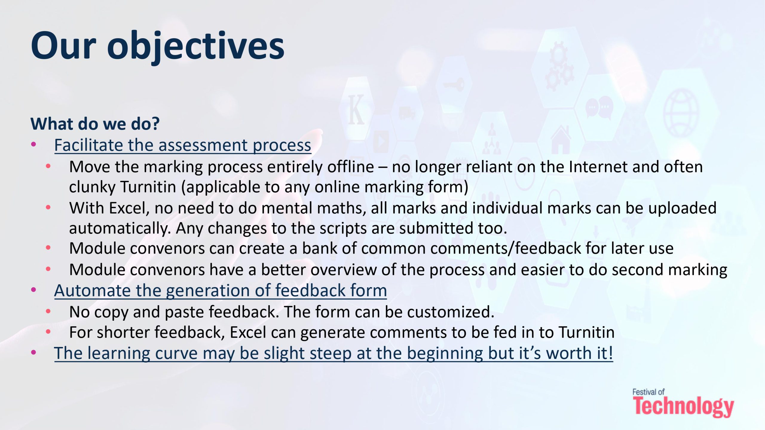
The process involved harnessing the power of Microsoft Excel and VBA Macros within Microsoft Word. These technologies allowed us to streamline and automate feedback delivery. Imagine, no more laborious hours spent typing feedback comments and no human errors involved in exporting and uploading the feedback documents to Keats/Turnitin! Instead, we could focus on providing students with valuable insights to help them excel.

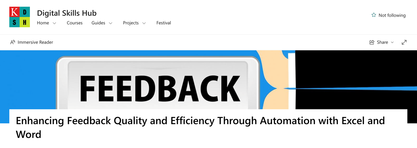
Screenshot of Digital Skills Hub

**Challenges Faced:**

Of course, no transformative journey is without its challenges. Some educators were initially resistant to change, finding the prospect of learning VBA Macros daunting. Additionally, ensuring the new system was compatible with various devices and platforms presented a technical hurdle. As I mentioned in the guidance (see from my SharePoint), the set-up and troubleshooting at the beginning can be quite a challenge, particularly for colleagues using the MacOS system (it’s less so for Windows users). Compatibility issues were addressed through rigorous testing and continuous monitoring of system performance. Clear communication with your marking team is also needed to make sure everyone is on the same page with the new system.

But I promise it’s worth the effort and the subsequential usages will be a much smoother sail. And from a marker’s perspective, it is much less work than working through the traditional channels.

The journey from traditional feedback systems to an automated approach using Excel and VBA Macros has been nothing short of transformative. It’s a testament to the power of technology in education, where innovative solutions can overcome challenges and improve the overall learning experience.

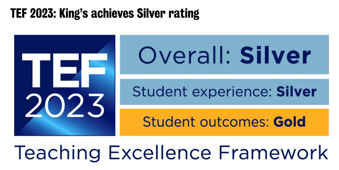
As we continue this path of exploration and adaptation, the future of feedback delivery looks brighter than ever to improved student satisfaction and educational outcomes. I hope that a wider adoption of the process could help deliver a more insightful and time effective feedback to our students, thereby addressing the burning issues identified from the student surveys, as well as helping deliver impacts to the quality of feedback giving and student experience, as identified in King’s Vision 2029 and the TEF framework.

Screenshot of TEF award

It takes time and communications with colleagues to identify compatibility issues and resolve them. So far, the method has been used by six Economics courses at KBS, two from the University of Glasgow; and colleagues from Marketing and Adult Nursing, have expressed their interests in using it in their courses.
It is definitely not perfect, and I am very much looking forward to feedback, comments, and of course successful implementations of colleagues.

The blog discusses a transformative journey in education, initiated during The Festival of Technology 2022 at KCL. It explores the adoption of Excel and VBA Macros within Microsoft Word to revolutionize feedback delivery. The main reasons for this change were to enhance feedback quality and efficiency, addressing challenges like resistance to change and compatibility issues. Through workshops, ongoing support, and rigorous testing, the adoption of technology resulted in a more efficient, user-friendly, and collaborative feedback system, empowering educators and improving the overall learning experience.

I would like to thank KBS colleagues, Jack Fosten, Dragos Radu, and Chahna Gonsalves for their encouragement, important suggestions and feedback as well as allowing me to pilot the process in their modules. I also thank various colleagues across other faculties for providing feedback and suggestions as well as identifying compatibility issues (with solutions).

For additional resources, including the workshop slides and a detailed guide with relevant codes and FAQs, please refer to the SharePoint folder linked here.

I am a Lecturer in Economics at the Department of Economics, King’s Business School, King’s College London. I am also an academic supervisor at the Institute of Finance and Technology, University College of London, and a chief examiner for the University of London International Programme (Econometrics). Before joining King’s, I lectured and conducted research at the London School of Economics as an LSE Fellow in Economics, and at the University of Warwick as a postdoctoral fellow (in Economics). I completed my PhD in Economics at the University of Nottingham in 2018.
I have lectured courses in econometrics and macroeconomics at King’s, LSE, and Warwick, and led seminars (tutorials) in various courses at Nottingham. From March 2023, I am the GTA Lead at King’s Business School.

Evaluation and Reflection, News and Events, Pedagogy, Technologies

Exploring the Digital Frontier: Revolutionizing Feedback Delivery with Excel and VBA Macros Part 1

Part 1: The practical guide

In today’s rapidly evolving digital age, the need for efficient and effective systems in education is more pronounced than ever. Traditional platforms like Moodle and Turnitin have served us well, but as educators, we must acknowledge their limitations in providing timely, user-friendly, and collaborative feedback on assignments, exams, and dissertations.

This tutorial aims to be your guiding light towards a better, more streamlined approach to feedback delivery. Drawing upon my workshop presented during The Festival of Technology 2022 at KCL, where I shared practical insights and implementation strategies for this automation system, we’ll delve into the fascinating world of Excel and VBA Macros within Microsoft Word. This comprehensive resource builds upon the principles discussed in that workshop.

By embarking on this journey, you’ll equip yourself with the skills and knowledge to revolutionize your approach to feedback giving. Here’s what you stand to gain:

1. **Efficiency:** Say goodbye to the laborious and time-consuming task of manually providing feedback using KEATs (Moodle/Turnitin). With Excel and VBA Macros, you’ll learn how to automate the process, saving valuable time that can be redirected towards more meaningful feedback and interactions with your students.


Screenshot illustrating what the purpose of the document
Picture 1: Our Aims and Objectives

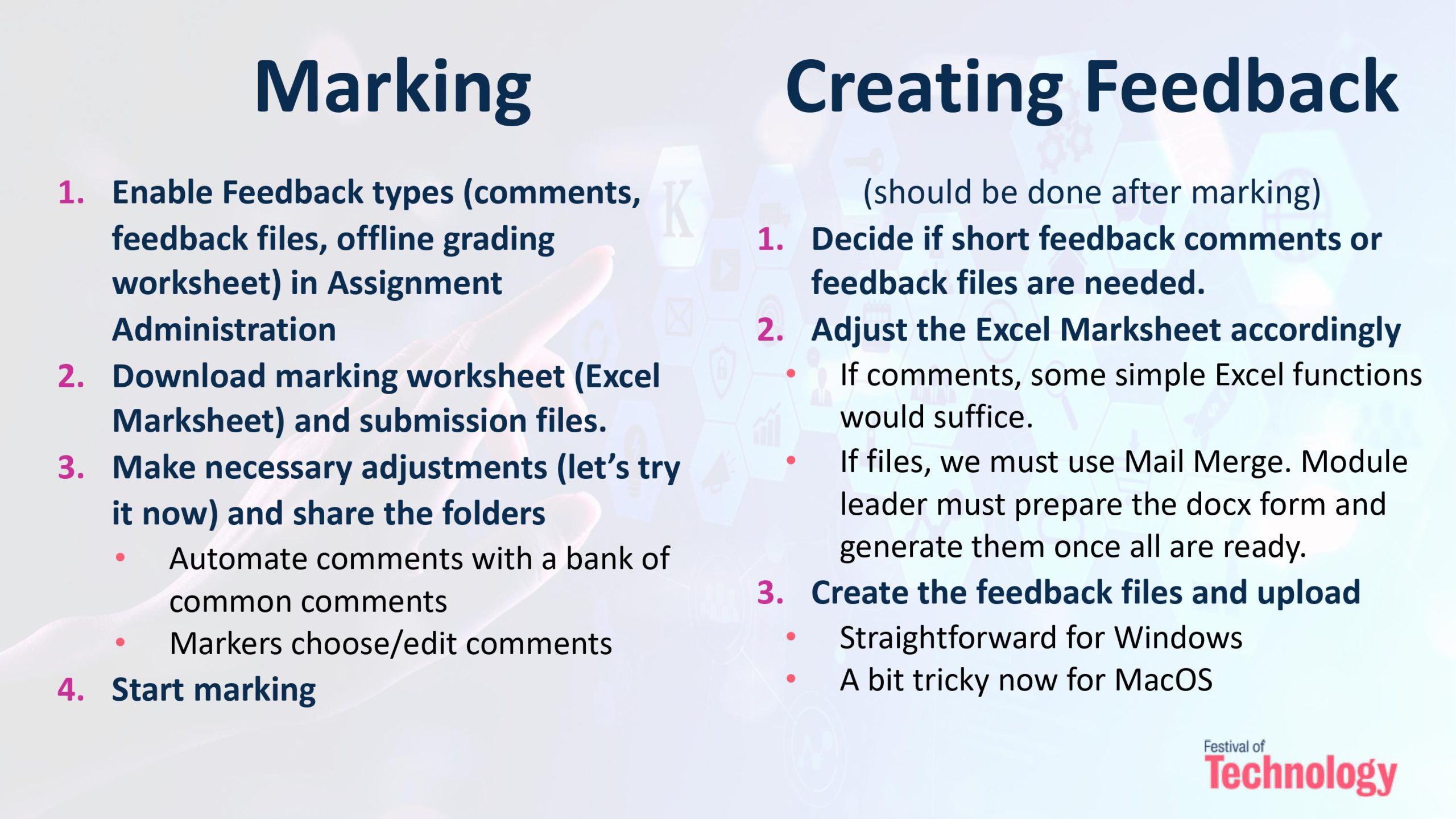
2. **User-friendliness:** Discover how to create a user-friendly feedback documents for both yourself, the marking team, and your students. Your feedback system will become intuitive and accessible, ensuring that learners can easily understand and act upon your comments with a nicely formatted feedback document.

A screenshot showing the step by step summary for collecting marking and feedback
Picture 2: A summary of steps

3. **Collaboration:** Break free from the constraints of limited collaboration within traditional systems. The method will allow a marking team to efficiently collaborate and moderate, making feedback delivery a seamless and cooperative effort.

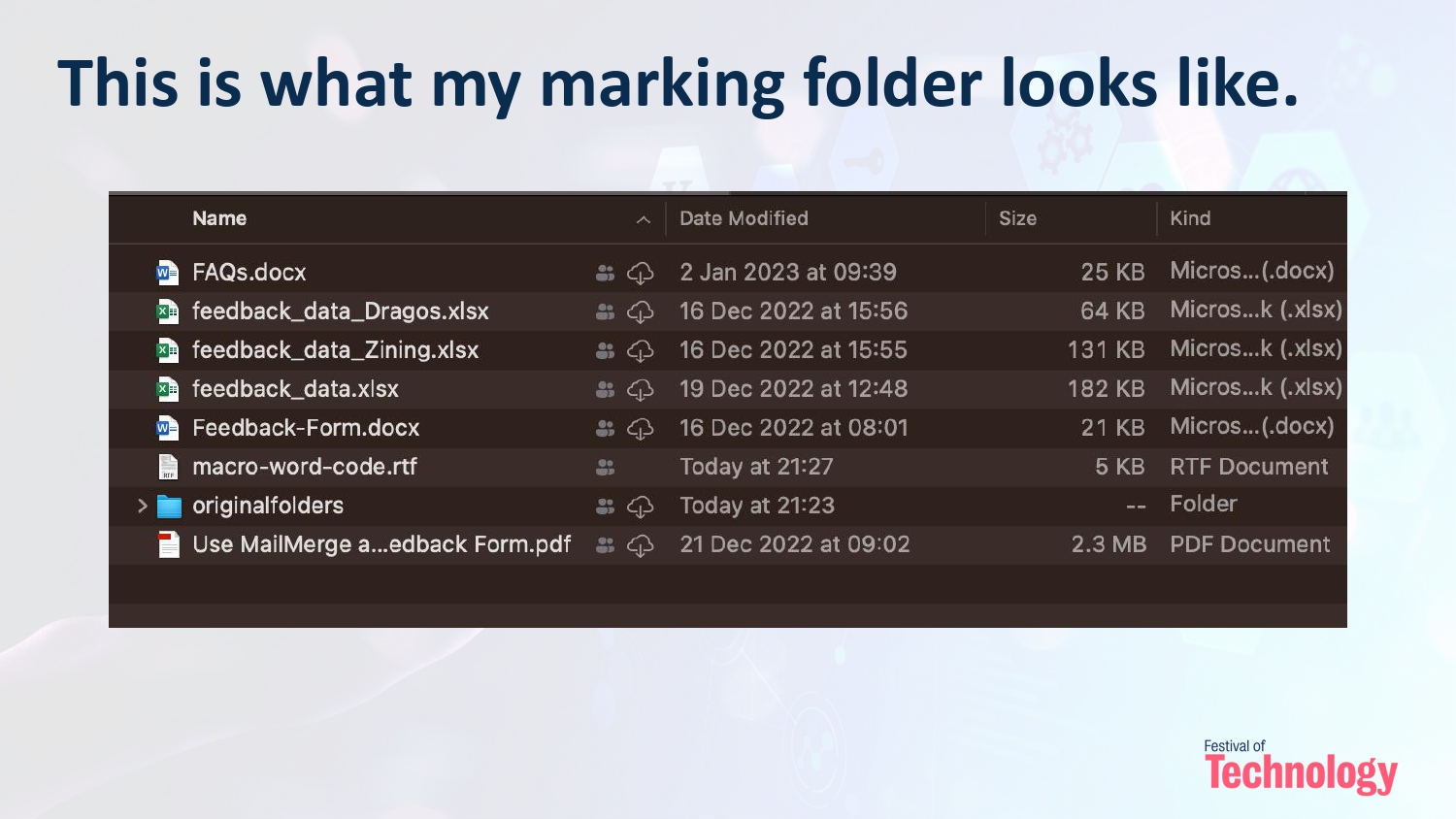
Screenshot of marking folder contents
Picture 3: What the marking folder looks like? It is sharable with the marking team

4. **Comprehensive Feedback:** Dive into the world of detailed and constructive feedback. You’ll gain the expertise to provide tailored insights that empower students to excel in their academic pursuits.

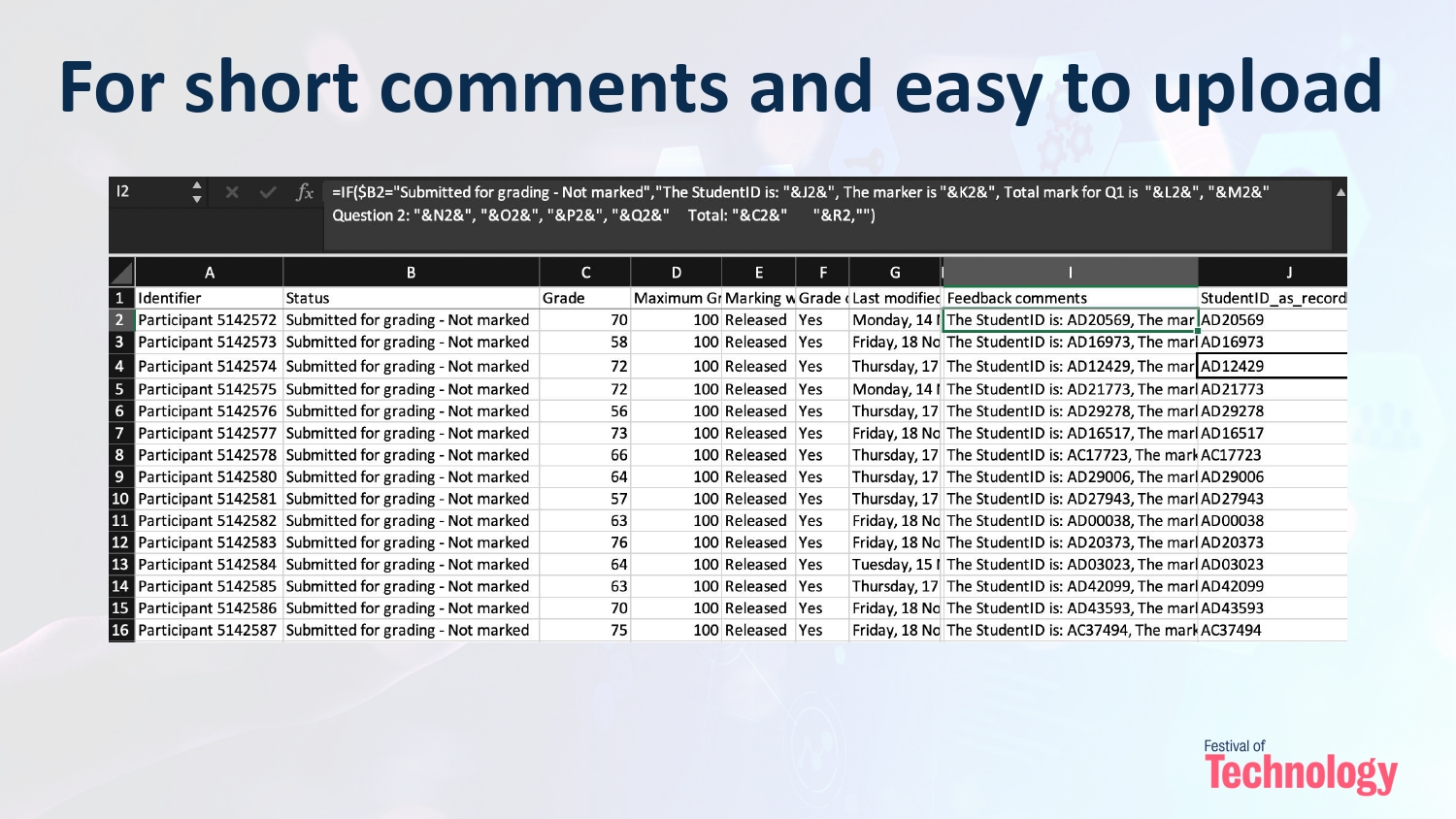
Screenshot of excel file showing comments
Picture 4: What a short comment looks like? Totally customizable.

This tutorial isn’t just about learning a new tool; it’s about transforming your approach to education. By mastering Excel and VBA Macros for feedback delivery, you’ll become a more effective educator, making a lasting impact on your students. The system will:
– Enhance your teaching methods, creating a more engaging and supportive learning environment.
– Free up your time that was spent on administrative tasks or dealing with Turnitin/Keats for more meaningful activities such as preparing feedback comments and communication with your team and students.
– For repeated courses/assessments, you can prepare a bank of modal comments for lateral uses, as well as a record of common mistakes and suggestions for improvements to communicate with students.

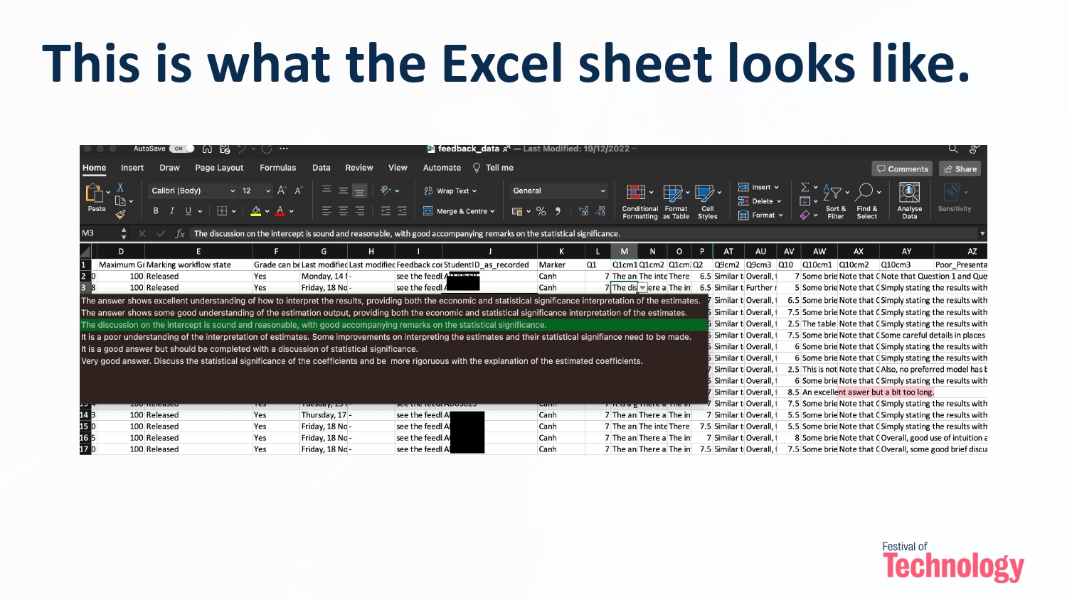
Screenshot of excel sheet
Picture 5: What the end product of a long feedback document looks like? Totally customizable.

Education is a dynamic field, and keeping pace with technological advancements is essential. The automation possibilities offered by Excel and VBA Macros are not just practical but also intriguing. Discovering how to harness these tools to optimize your feedback process can be genuinely exciting.

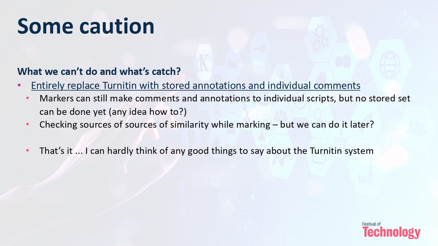
Screenshot displaying cautions with using excel
Picture 6: A few cautions?

For additional resources, including the workshop slides and a detailed guide with relevant codes and FAQs, please refer to the SharePoint folder linked here. This tutorial serves as a bridge between the insights shared during the workshop and the practical implementation of an automated feedback system. It’s an opportunity to further explore and master these valuable techniques, all while enhancing the overall learning experience for students. Join us as we embark on this transformative journey together.

Part 2 of this blog can be found here: https://blogs.kcl.ac.uk/digitaleducation/exploring-the-digital-frontier-revolutionizing-feedback-delivery-with-excel-and-vba-macros-part-2/

News and Events, Pedagogy, Technologies

Centre for Technology Enhanced Learning (CTEL) CPD Training Sessions

The Centre for Technology Enhanced Learning (CTEL) has a wide range of new development sessions available to all staff. These sessions range from how to record, edit and upload videos; creating interactive learning resources using Kaltura, our video and media service; as well as various workshops on using KEATS, our Virtual Learning Environment.

These sessions will be run by Microsoft Teams Meetings. Click the Skills Forge links below to find timings and book on available sessions. Please contact ctel@kcl.ac.uk for more information.

Introductory Session

KEATS

Content Creation and Video Editing

Delivering synchronous online teaching

Assessment

Internationalisation

Moodle 4, Pedagogy, Technologies

Introducing the New KEATS Education Templates

The KEATS Education Templates (KET) are a set of standardised templates that have been designed to improve the digital learning experience for students at King’s College London. The templates adhere to UXD (user experience design) good practice, and are designed to be performant, scalable, and in line with accessibility standards.

The KET were developed in consultation with King’s students and academic and professional services staff. They were, and continue to be, steered and shaped by the needs of their users.

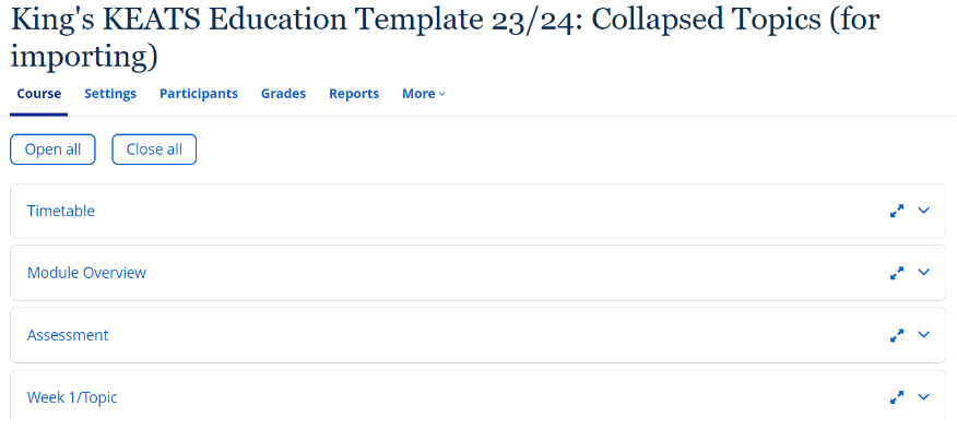
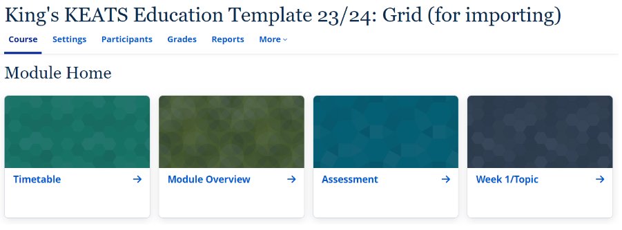
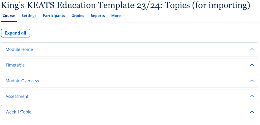
Three formats for the template are available for use.

Collapsed Topics

King's KEATS Education Template 23/24: Collapsed Topics (for importing) showing the categories of; course, settings, Participants, Grades, Reports and More. The Course highlights different tabs such as; Timetable, Module Overview, Assessment and Week 1/Topic

Grid

Screenshot showing the Module Home page featuring a Timetable, Module Overview, Assessment and Week 1/Topic tabs.

Topics

Screenshot of King's KEATS Education Template 23/24: Topics (for importing) showing the categories of; course, settings, Participants, Grades, Reports and More. The Course highlights different tabs such as; Timetable, Module Overview, Assessment and Week 1/Topic

Why use the KEATS Education Templates?

The benefits of using the KEATS Education Templates, include: 

User Experience: The templates are designed to be easy to use and navigate, making it easier for students to find the information they need. 

Scalability: The templates are designed to be scalable, so they can be used for courses of all sizes. 

Consistency: The templates help to create a consistent look and feel across all KEATS course pages, which can help to improve the overall user experience. 

How to use the KEATS Education Templates

You will find guidance on implementing the templates on the KEATS Education Template (KET) Guidance page.

The guidance includes step-by-step instructions for adding the template to your KEATS page and a checklist of tasks required to edit the page after applying the template.

The first page of the guidance (Overview) includes links to the importable templates, as well as example courses with the templates applied.

Written by Fariha Choi 

Fariha Choi is a Learning Technologist at the Centre for Technology Enhanced Learning and has been with CTEL since June 2021. She has a particular interest in educational multimedia and has worked as a Learning Technologist, eLearning Developer and Learning and Development Manager for the past 11 years. 

Moodle 4, News and Events, Pedagogy, Technologies

New look KEATS coming in July 2023

KEATS will be upgraded to Moodle 4 on 18 July 2023 (see KEATS Upgrade to Moodle 4 Blog post for further information).

As part of this upgrade the look-and-feel of KEATS will be updated to bring it in line with emerging King’s Digital Brand Guidelines, improving consistency for staff and students across our digital platforms.

The new theme for KEATS will be primarily available for layouts which display modules and courses in a Topics or Grid formats. All course pages will be presented with a left-hand navigation and a right hand-panel for module/programme specific information as required, both of which can be expanded/collapsed as required.

KEATS Course Grid Format

KEATS new-look grid format
KEATS New Look Grid Format

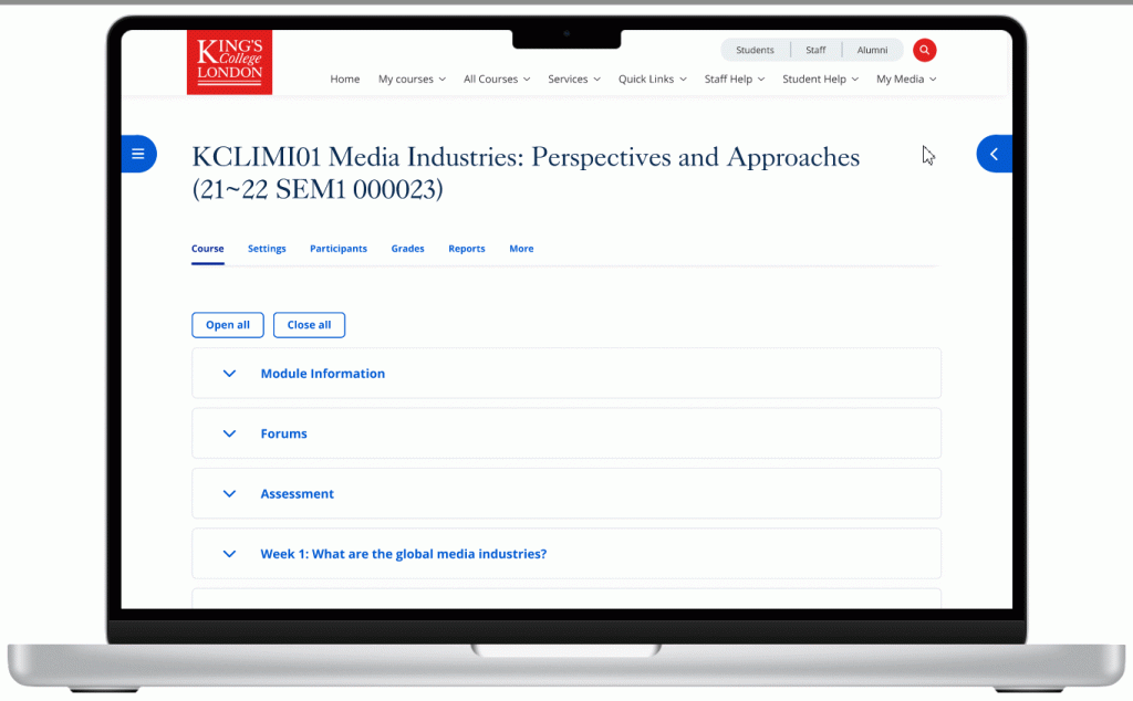
KEATS Course Topics Format

GIF of a new look KEATS Course Topics Format
New Look KEATS Topics Format


Screenshots

Click on the screenshots below to view larger images of the new look-and- feel for KEATS coming in July 2023.