Evaluation and Reflection, Moodle 4, Pedagogy, Technologies

Designing Assessment Pages that Works for Students: What UX Research Told Us

Overview

Assessment is one of the most high-stakes parts of a student’s learning experience. Yet the way assessment information is presented on KEATS has until now been largely left to individual modules, leading to inconsistency, confusion and unnecessary friction at the moments students can least afford it. 

This article presents the case for a redesigned Assessment Template for KEATS, drawing on user research with King’s students and following the design process from Discovery through to Delivery. It aims to provide a practical, evidence-based rationale for the template and support colleagues in considering its adoption within their own modules. 

What the research told us 

The need to redesign the KEATS Assessment section emerged from UX research into students’ experiences of navigating module pages. During the interviews with thirty King’s students, assessment-related tasks consistently surfaced as the most significant pain point. Common challenges included:  

Findability of assessment is the biggest blocker. Students frequently encounter assessment details spread across multiple locations (pages, documents, links). This makes it difficult to build a clear understanding of requirements, deadlines, and expectations. 

Submission is not clearly signposted. Students often struggle to confidently identify where to submit, even when they find the relevant section. Submission links can feel hidden, out of place, or insufficiently emphasised. Not visually distinct is a common complaint when assessment submission links look like any other blue link.  

Label and heading ambiguity create risk. Participants repeatedly mentioned heading and naming confusion, such as multiple similarly named links. Ambiguous titles (i.e. January submission) drive errors, especially close to deadlines. 

Overload from dense or excessive assessment content. Assessment briefs, guidance documents, and submission links are often presented at the same visual level resulting in poor hierarchy between information, submission, and supporting materials. 

Uncertainty around deadlines, weighting, and requirements. Critical information such as deadlines or formats is not sufficiently highlighted or standardised and thus students express confusion about deadlines or what exactly needs to be submitted. 

Grades and feedback are not always easy to locate. While it wasn’t a primary focus of the user research, a few students mentioned that they struggle to find where grades are released in a timely manner. 

The research not only highlighted the challenging aspects of navigating assessment but also provided a clear direction for improvement. Students consistently expressed a need for an assessment section that follows a consistent and predictable structure, is easy to scan, and presents key information clearly without overwhelming them with dense text. 

Why we’re doing this 

The goal of the Assessment Template is simple: students should always know where to find what they need, regardless of which module they’re on. This reinforces the need for a consistent and predictable assessment experience, with a single, trusted location where students can easily access key information, understand requirements, and complete submissions without searching multiple areas in the module. The template provides this structure, while still allowing academic teams to customise the content within it. 

How we got here: solution discovery 

I explored a range of real assessment scenarios to ensure the template was grounded in actual module needs, not just a theoretical ideal. Four use cases shaped the design 1. Coursework only 2. Remote online exam 3. Coursework + remote online exam 4. Coursework + online exam in person. This helped defined the right design opportunities: 

– How might we give students a single, trusted starting point where they can immediately understand all assessment requirements and deadlines?  

– How might we ensure the submission area is placed where students expect it, reducing confusion and last-minute submission stress?  

– How might we make assessment pages easy to scan, so students can locate what they need in seconds?  

Two design directions emerged from this wireframing process. Both had the same content; the key difference was where submission links were placed. In Design A, submission links appeared inline within each assessment section. In Design B, they were consolidated into a dedicated ‘Submission area’ at the bottom of the assessment section. We put both to testing. 

Usability testing 

An unmoderated usability testing was conducted using Maze (a user research and testing tool) to compare the two assessment page designs. The testing aimed to assess students’ experience of the assessment section as a whole, rather than focusing solely on any one component. A total of 37 participants took part across the two design variants, comprising both King’s students and members of the public. 

Including public participants alongside King’s students allowed us to compare the experience of users familiar with university learning environments against those encountering it for the first time, helping identify design patterns that were intuitive regardless of prior experience. 

Screenshot of the heatmap interaction for the assessment section in Maze.

Key takeaways 

Page structure and headings were validated. The assessment summary table providing an overview of all assessments, types, weightings, due dates, and feedback timelines received an ease-of-use rating above 4.0 out of 5. The ‘General guidance’ section was also well received, with the majority of participants reporting it contained ‘just enough’ information which means not too sparse nor too overwhelming. 

The submission-flow results strongly favoured Design A. Across all participants, submission links were located 23.9% faster and users reported 20% greater confidence when submission links were embedded within their associated assessments, compared to when they were grouped into a separate area. This was the clearest and most consistent finding across the testing. 

Students hold a clear mental model: an assessment is one unit. The brief, the resources, and the submission link belong together. The template honours this expectation by keeping these elements together, making the page easier to scan and the submission journey more confident at the moment it matters most. Separating these elements created a mental disconnect that led users to search in multiple places before finding what they needed. 

Looking ahead 

For now, implementing the template is still a manual process, requiring academic teams to work through guidance and replace placeholder content directly within the page. While straightforward, it does require some familiarity with KEATS. 

Looking further ahead, we have plans to work with our developers to make this process significantly more automated and intuitive, feeding in information from tools like CourseLoop and SITS. This structured approach would reduce the risk of misconfigured pages, make the template easier to adopt for less confident KEATS users, and make consistency the default outcome rather than something that requires additional effort. 

When students know where to look, they spend less time navigating and more time on what matters. A consistent, well-structured assessment section is not a small UX improvement. It is a scalable intervention in the student assessment experience that reduces uncertainty and supports student success across modules. 

If you are interested in implementing the new Assessment section on your KEATS Module, please do reach out to your Faculty Digital Education team or DigiEd directly. 

About the author 

Madison Wang is a Product Designer at King’s Digital, collaborating with Digital Education agile teams to improve the KEATS experience for staff and students. Part of the UX team, specialising in end-to-end design and translating user research and insights into practical, evidence-based solutions. 
Evaluation and Reflection

KEATS Similarity Checker Project

Overview of project

Between July 2022 and February 2023, the SSPP TEL team conducted a pilot project to improve the student experience when submitting assignments by creating a special area for students to check the plagiarism/similarity score of their assignments. The goal of the pilot was to make it easier for students with Mitigating Circumstances and the Programme Office staff to manage the process of submitting assignments to KEATS.

Any student who is not subject to Mitigating Circumstances can submit a draft and/or reupload their submission as many times as they wish up to the assessment’s original due date. Many students use this opportunity to submit a draft to check their similarity score before they make their final submission. At the moment, due to technical limitations within KEATS/ Turnitin, students who are granted an extension to an assessment via the Mitigating Circumstances process cannot submit a draft to check their similarity score; they are only allowed to submit once, and after the due date for the assignment passes they no longer have the option to upload their final version.

This is particularly problematic for students who have submitted a draft (sometimes long before the original due date) and then realise they need to apply for Mitigating Circumstances: as they are not able to delete the draft themselves, this draft will be considered their final submission and their MC claim may be rejected on the basis that they have already made a submission. In some departments, PS Staff sometimes agrees to submit and/or delete a draft for a student, but this is time consuming, not consistently applied, and it relies too much on PS Staff being available and inclined to help outside of their normal duties; it is also not sustainable when taking into account the very high number of MC claims we process at the moment.

First Steps

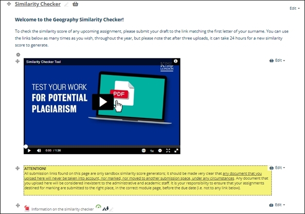
The departments of Geography and Global Health and Social Medicine in the Faculty of SSPP took part in the initial pilot project for their re-sit and dissertation students, and the Similarity Checker (SM) area was created and placed on their Handbook pages on KEATS. Accompanying it was a video and PDF to explain to students how to use the SM, as well as a warning text to reinforce the idea that this did not count as a submission and would not be checked by staff.

Feedback from this small cohort of students led to some revisions and changes to the SM, the most notable of which was around the language used. We had used the words “test area”, meaning to check or trial something, but students for whom English was not their native language found this confusing and equated “test” to mean exam. This was revised and the wording was changed from “test submission area” and “test area” to “Similarity Checker” and “practice area” respectively.

Once we were happy with the revisions, the SM was then rolled out to the rest of the School of Global Affairs, War Studies, and Education, Communication and Society. All Similarity Checker areas have the same layout, same wording and same instructions for parity across all the Schools. Communications for staff and students were also created by Soshana and these were used by Departments to make students and academic staff aware of the existence of the SM.

Layout

The Similarity Checker is made up of several parts. This includes an introductory text explaining what it would be used for, how to use it and a disclaimer that nothing submitted here would ever be moved nor assessed. An explainer video and PDF instructions were added to ensure accessibility and inclusive design were adhered to, so that all students would be able to clearly understand the functionality.

Screenshot of the home screen of the similarity checker.
Screenshot of the geography similarity checker.

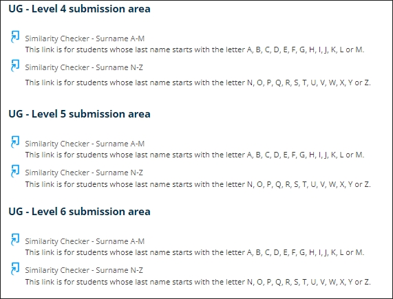
The submission areas were divided by level and surname. There is no functional necessity for this, but it aims to prevent Turnitin from getting overloaded by all students in the one department trying to access it at the same time. If students submit in the wrong area there are no effects on their score or submission.

Screenshot of the different Turnitin Submissions.

Student Feedback

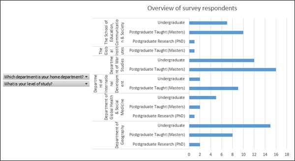
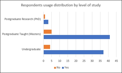
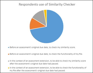
A survey was created by Soshana and shared with all participating Schools, with almost 100 responses. Feedback was generally positive, with students highlighting how the SM improved their experience and confirming that it constitutes an equalising factor for students with extensions. Overall, 90% of respondents have used the SM, 93% found it useful, and 16% used it in the context of an assessment extension (mitigating circumstances).There was also some negative feedback from students who did not find it particularly beneficial, mainly due to the long turnaround time for their score after their third submission, as well as the fact that their score changed repeatedly when uploading a new draft of the same work, depending on how close the assessment due date was. These concerns will be addressed, and elements of response will be provided in future communications.

Overview of survey respondents.
Respondents usage by level of study.
Respondents use of the Similarity Checker.

Conclusion and next steps

The pilot project was a successful start to improving the experience of students and staff using KEATS and Turnitin during their submission period. This was initially to improve the experience of those with Mitigating Circumstances, but we can see that many students without extensions are also using it to check their work.

Next steps will include rolling this out further to other Schools or Departments so that all students in SSPP can access it. Some Departments have their own versions, which we would like to replace with this more modern iteration of the Similarity Checker.

As next steps, the TEL team would like to address some of the points that the students raised as part of the feedback process, and create a communications plan to ensure this is being communicated to students at all relevant points of the academic year.

An all-Faculty stance should also be drawn up if/when a student submits their paper to the Similarity Checker instead of their module page and how this should be dealt with.


Written by Leanne Kelly Leanne Kelly

Leanne is the Digital Education Manager for the Faculty of Social Science and Public Policy (SSPP) at King’s College London. She is responsible for a wide range for digital education processes within the Faculty including instructional design, accessibility, training, innovation and developing new online programmes.

She has a background in publishing and eLearning, and is passionate about using technology to improve the learning experience and make it more accessible to all. She is interested in developing new ways of working, scaling projects and reusing content in new ways, and making online learning an enjoyable process for all.

Written by Soshana Fearn

Soshana Fearn

Soshana is the Senior Postgraduate Programme Officer for the Department of Geography (SSPP) at King’s College London. She delivers the day-to-day administration of taught postgraduate programmes (Masters), offers comprehensive and authoritative advice and support for all staff and students in respect of programme regulations and curriculum choices, services the relevant boards and committees, and oversees the processing of Mitigating Circumstances requests.

She has a background in project coordination and is dedicated to improve the experience of both students and staff through the development and implementation of streamlined innovative solutions, including projects related to institutional processes, policymaking and technology-enhanced learning resources.