Purpose
Clutter is never fun, be it when it’s the reason you can’t find an email or a long-lost t-shirt, sometimes you need to have a good sort through and re-organisation! Over the years, we had been gathering and developing a lot of careers information and as we accumulated more and more resources across over 10 individual KEATS careers courses, it was time for a de-clutter and sort!
The one-topic format presented an opportunity to take all the individual courses and streamline them into one easily navigable and interconnected KEATS course. The reason the one-topic style was so successful at achieving this was the ‘child sections’ which appear in the tabs bar, thus allowing a selection of sections to sit below a top sections that would direct users to them. The benefit is that this allows programme administrator or teacher) to essentially create a collection of sections within one course ‘hub’. If the user selects a different top sections the child sections are replaced by a different set, ensuring the page never looks cluttered and the user is not overwhelmed seeing every single section available.
Figure 1: Careers ‘One Topic’ view course before the sections were hidden
The added benefit of having several sections sitting within one ‘hub’ top section is that you can link to more information without taking the user away from their current course impacting on the usability. The one-topic interface will also maintain the standard links and direction arrows to the next section of content at the bottom of the screen to encourage the user to go through the content in a linear manner. This encourages users to read on and move to the next section which is useful when you want to user to leave with one chunk of information but a rounded understanding.

Figure 2: Next Section of Content button
Things to consider
Navigation
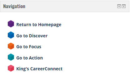
For navigation, there are the three main buttons (Discover, Focus and Action) from the main area, as shown below, but we also added a right-hand block with links to the top sections.

Figure 3: Main three buttons (Discover, Focus and Action) on the Careers KEATS course
All child sections can be accessed through each of the top sections, that are hidden from the main page, to complement the simple layout that we wanted to achieve. All the subsequent child sections are then accessed from the main sections that we created, through buttons that are displayed on each of corresponding sections. This gives the user the ability to always go back to their previous sections using the navigation buttons on the right. All child sections will have a link at the bottom of the page to take users back to the sections they came from, to help act as bread crumbs for users that would like to retrace their steps.


Section moving
Since this style encourages uses to go through in a linear manner it is worth considering what order you want users to complete the section in. This is especially relevant because moving sections can be rather fiddly and requires you selecting ‘Tabs edition Utilities’ from the bottom of the section you wish to move then clicking section you wish to take the place off which can become a little tiresome when moving multiple sections around so it worth giving some forethought to how you want your sections arranged.
Going forward
The response we have received has been incredibly positive with staff and students complementing the intuitive navigation and linear path that they are encouraged to go through the sections. In the next month we will roll this style out for all our Careers KEATS pages that sit within different faculty/department sections to ensure all student engagement with KCL Careers and Employability is consistent. We are also continuing to work on improving our side bar navigation to condense certain topics to create a cleaner look.


