 At the beginning of April this year, we opened a new web site: the Greenroom.
The Greenroom is a web site where teachers who teach with Greenfoot can share resources and have discussions. It was clear for a while that sharing of resources was a powerful thing that was urgently needed for the Greenfoot community. Greenfoot is different from many other environments, teaching with it requires different projects and different ideas, and thus getting started with it, as a new teacher, is challenging. Having a community to talk to, to ask questions, to get ideas, to get tried and tested material, makes a huge difference.
Yet, this is a space where many have failed.
It is often said, with only slight exaggeration, that there are more teaching resource repositories than there are teaching resources. The fact is, countless resource repositories have been created, and most of them have tumbleweed blowing down the main street.
The typical pattern is this: A repository is opened, a flurry of activity follows, resources are submitted (often by the creators and other people personally involved or contacted), and then it dies down. A few months later, little is happening, resources are not maintained, few new resources are added, you can hear the cold wind blowing through empty spaces.
A high profile example is the repository of resources on the ACM SIGCSE website (one of the largest organisations in computer science education). It was – as far as I know – opened in early 2004, and initially attracted a good number of submissions. However, this quickly died down. Looking at the recent submissions, it seems that only four resources were submitted in all of 2008. This went down to three in 2009, with one single submission (so far) in 2010.
Now, I don’t want to pick on that one particular repository specifically. This pattern is not unsusual. I am pointing to it here as a typical example. Making repositories thrive is hard. (We have recently published a paper about this.) So, when we designed the Greenroom, we were very worried about meeting the same fate: spending a whole lot of effort in creating a repository site, only to have it die a slow, quiet death after a few short months.
I am happy to say that we seem to have avoided that fate. The Greenroom is alive and well.
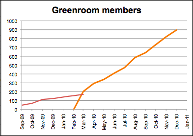
From September 2009 to March 2010, the Greenroom existed as a Google Group. This gave us an excellent discussion forum, and quite poor storage of resources. Over these first six months, about 170 people signed up. Then, at the end of March 2010, we finished our custom implementation of the new Greenroom, and we were amazed at the result: even though only half of the Google Groups subscribers moved over, we surpassed the old subscriber numbers within two weeks, and then they continued to climb. Now, after eight months, we have about 900 people signed up. Lots of resources have been posted, and many interesting discussions are going on.

Subscriber numbers of the Greenroom; old (red) and new (orange)
So, what makes this site work, when so many others have failed?
I think, in building such a site, you need to address a number of questions:
- Who is allowed to upload resources? Everyone, or only trusted people?
- How do you ensure quality? By prior review (work-intensive, hard), or do you let everything in (and risk flooding by poor quality, untried material)?
- Do you restrict access? (If only teachers can access, you can also post exercises with solutions, exams, etc. But then you need verification.)
- How do you maintain the resources? Who looks after them?
- Do you store local copies of resources (which may go out of date) or links to outside resources (which may break)?
- How do you organise searching and browsing? This requires relating resources to each other – who does that work?
And most importantly:
- How do you make people come and submit interesting material, and participate in interesting discussions?
I think there are some design choices you can make to address many of these things. As a result, we have built a repository site that is quite different from others. We decided to not use a standard platform (because they only gave us the same old stuff that we didn’t want) and build our own from scratch. The main design choice, which makes most of the difference is this:
The site must be about people, not about stuff.
So we designed a site that is primarily about community, and then about material. There are many design details that embody this idea:
- The main page of the site shows activities of people, not lists of things.
- People sign up to the site, and have an ongoing relationship with it. It’s not something where you go once every two years when you redesign your course, it’s a place where interesting things are happening every week or maybe even every day.
- People sign up with their real names, and are encouraged to post profile pictures. In the Greenroom, you move in a community of peers, not in a big, anonymous black hole.
- The mental model is that of a staff room in a school, not of a library. It’s about meeting people, not about searching through piles of stuff.
- Submitting unfinished resources is welcomed. We all know that most things never get finished – submitting something is better than submitting nothing.
- The resources are owned by the community, not by single people. The edit rights follow a wiki model: everyone can edit everything. (I remember the moment in our design discussions when Neil Brown, one of our team members, suggested this. This changed almost everything. Many of the questions posted above are affected by this. Like many good ideas, it seems obvious in retrospect, but wasn’t at the time.)
- Small contributions are welcome. Linking some related resources, for example, is a good thing. It’s quick, anyone can do it, and the wiki model allows everyone to do it.
In short: I think people should re-think teaching repository design. It has worked for us. (More details about this are in our paper.) There is daily activity in the Greenroom, many people visit regularly, we have frequent interesting discussion in our forum, and a large number of excellent resources. It has been going much better than we dared to hope.
So, if you think about designing a resource repository, think about the people, not about things. And if you are a teacher interested in Greenfoot, join the Greenroom. There are many friendly people there happy to help.


