While working with Naru to design our new 2nd year GIS methods training course (with parallel QGIS and ArcGIS streams!), I came across a rather striking map on the ESRI blog that managed to combine both slope (steepness) and aspect (direction) in a single representation. This post explains both a problem with the way that the colour scheme was specified and how to replicate this type of map in QGIS (with style sheet).
The Inspiration
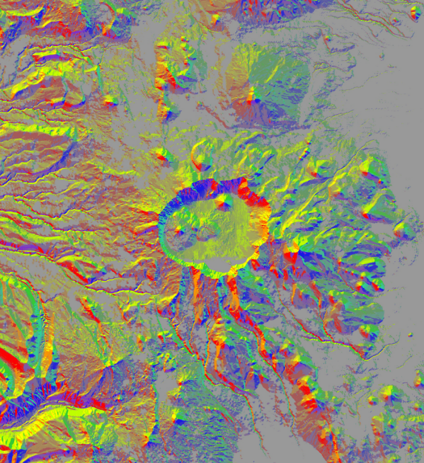
Here’s Aileen Buckley’s Aspect-Slope map in all its glory – this is a the area around Crater Lake, Oregon, and you can see that it neatly captures both the direction of slopes (aspect) and their steepness (degree). So features like the crater stand out really clearly, as do what I assume is evidence of lava flows and such, while lesser features gradually fade towards grey, which means flat.

So these maps combine two properties:
- The direction of the slope is expressed in the hue – different directions are different colours.
- The steepness of the slope is expressed by its saturation – steeper slopes are brighter colours.
Rather than just jump into providing you with a style sheet, I think it’s useful to trace this back to its constituent parts as it turns out that ESRI has made a mistake in setting up their colour maps.
Aspect Mapping
Aspect maps give the viewer a sense of the direction in which various slopes derived from a Digital Terrain Model (DTM) lie – typically, we do this by dividing the angle of the slope into eight quadrants: North, Northwest, West, Southwest, South… well, you get the idea.
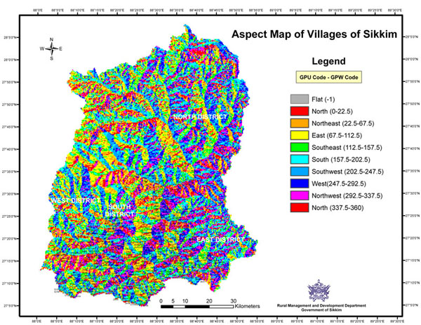
Here’s an example of what the standard aspect map out of ArcMap looks like as posted by the Rural Management and Development Department of Sikkim:

This, helpfully, gives us the ranges that we’ll need for our aspect-slope map. Note, however, that we don’t really have any idea how steep any of these obvious hills are.
Slope Mapping
Slopes maps are, obviously, intended to fill in the gap in terms of how steep an area is. Typically, we can measure this as either a degree value from one raster cell to the next of the DTM or as a percent/ratio (1-in-10 gradient = 10%). Here’s a nice example looking at the link between coffee bean growing areas and slope in Costa Rica:

Unlike the aspect map, the divisions used in the slope map seem to be largely arbitrary with no real consensus on the mapping between measured steepness and terminology. The clearest guidance that I could find came from The Barcelona Field Studies Centre and looked like this:
| Slope (%) | Approx. Degrees | Terminology |
|---|---|---|
| 0.0–0.5 | 0.0 | Level |
| 0.5–2.0 | 0.3–1.1 | Nearly level |
| 2.0–5.0 | 1.1–3.0 | Very gentle slope |
| 5.0–9.0 | 3.0–5.0 | Gentle slope |
| 9.0–15.0 | 5.0–8.5 | Moderate slope |
| 15.0–30.0 | 8.5–16.5 | Strong slope |
| 30.0–45.0 | 16.5–24.0 | Very strong slope |
| 45.0–70.0 | 24.0–35.0 | Extreme slope |
| 70.0–100.0 | 35.0–45.0 | Steep slope |
| > 100.0 | > 45.0 | Very steep slope |
A Better Aspect-Slope Map Scheme
In order to create an aspect-slope map, we need to combine the two data ranges into a single number that we can use as a classification, and this is where the ESRI blog approach goes a bit off the rails. In their approach, the ‘tens column’ (i.e. 10, 20, 30, …) represents the steepness – so 0–5 percent slope=10; 5–20 percent slope=20; and 20–40 percent slope=30 – and the ‘units columns’ (i.e. 0–8) represents aspect – so 0–22.5 degrees=1; 22.5–67.5 degrees=2; etc.
The problem with this approach is that you have a lot of problems if you want to add or remove a steepness category: in their example the highest value is 48, which means ‘highest value’ and an aspect of Northwest. But what if decide to insert a class break at a 30 percent slope to distinguish more easily between ‘Extreme’ and ‘Steep’? Well, then I need to redo the entire classification above 30… which is really tedious.
If we switch this around such that aspect is in the tens column (10–80) and steepness in the units column (0–9) then this becomes trivial: I just add or remove breaks within each group of 10 (10–19, 20–29, etc.). No matter how many breaks I have within each aspect class, the overall range remains exactly the same (10–89 if you use the full scale) regardless of the steepness classification that I’m using. It’s not just easier to modify, it’s easier to read as well.
Implementation in QGIS
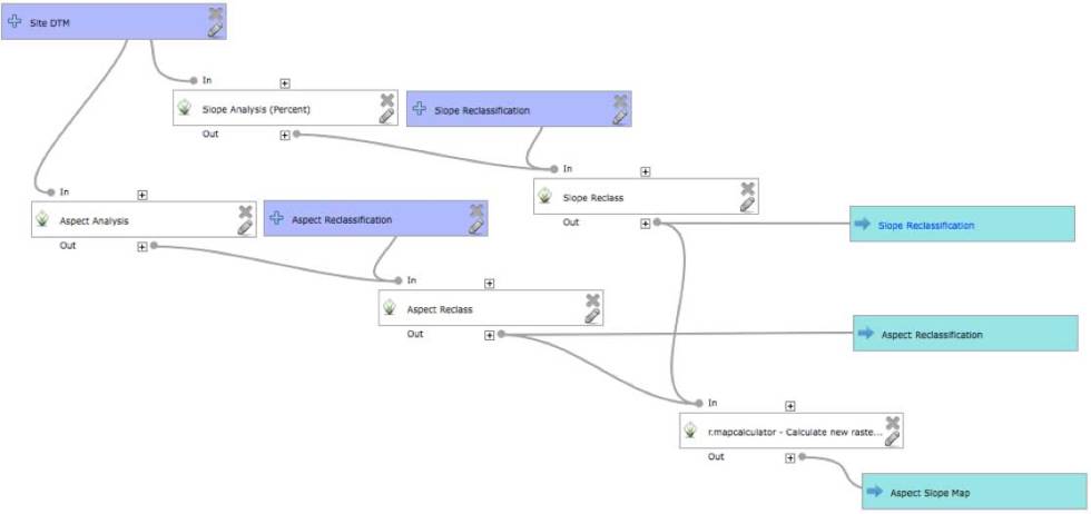
For all of this to work in QGIS, you need to generate and then reclassify a slope and an aspect analysis from the same DTM. You can do this using outputs from the raster Terrain Analysis plugin (that’s the point-and-click way), or you can build a model in the Processing Toolbox (that’s the visual programming way). I personally prefer the model approach now that I’ve finally had a moment to understand how they work (that’s a topic for another post), but one way or the other you need to get to this point.
Regardless of the approach you take (manual or toolbox), once you’ve got your two output rasters you then need to reclassify them and then combine them. Here’s the mapping that I used to reclassify the two rasters as part of a model. You would copy these lines into text files and then use the GRASS GIS reclassify geoalgorithim while specifying the appropriate reclassification file.
Aspect-Reclassify.txt
0.0 thru 22.499 = 10
22.5 thru 67.499 = 20
67.5 thru 112.499 = 30
112.5 thru 157.499 = 40
157.5 thru 202.499 = 50
202.5 thru 247.499 = 60
247.5 thru 292.499 = 70
292.5 thru 337.499 = 80
337.5 thru 360.5 = 10
Slope-Reclassify.txt (for percentage change)
0.0 thru 4.999 = 0
5.0 thru 14.999 = 2
15.0 thru 29.999 = 4
30.0 thru 44.999 = 6
45.0 thru 100.0 = 8
So that’s a 5-class steepness classification, but you could easily set up more (or fewer) if you needed them.
Once you’ve reclassified the two rasters it’s a relatively simple matter of raster layer addition: add the reclassified slope raster to the reclassified aspect raster and you should get numbers in the range 10–88.
Here’s the model that I set up (as I said above, more on models in another post):

Specifying a Colour Map
Taking the ‘Aspect Slope Map’ output, all we need to do now is specify a colour map. I took the colours posted by ESRI in the colour wheel (as opposed to the ones specified in the text) and converted them to hexadecimal since that was the easiest way to copy-paste colours. I think, however, that I’ve ended up with a slightly ‘muddier’ set of colours than are in the original Crater Lake set as you’ll see with my ‘Sussex Aspect-Slope Map’ below:

And, finally, the QGIS style sheet file is here (sorry about the zip format but .QML is not a recognised style type):
Aspect Slope Style – Close to Original.qml
Wrap-Up
I’m sure that this style sheet could be further improved (and may even try to do so myself, though I’d also welcome submissions from anyone with some time on their hands), but at least this gives users and easy way to combine representations of slope and aspect in a single map using a reclassification scheme that is simple to extend/truncate according to analytical or representational need. Enjoy!