
There is an apocryphal story about Queen Victoria. Having enjoyed Alice’s Adventures in Wonderland, the queen requested a copy of Lewis Carroll’s next book. Carroll, whose real name was Charles Dodgson, duly obliged. Except that Charles Dodgson was an Oxford mathematician and his next book was An Elementary Treatise on Determinants. Queen Victoria presumably responded, “We are not amused”! All this is simply by way of introduction to say that this blog post is rather more technical than many on this site and if you are not interested in the technicalities you may want to skip over this posting. Hopefully, the next one will be more to your liking.
ROC curves and the associated Area Under the Curve (AUC) are increasingly used in reporting results of diagnostic biomarkers and classifiers developed by artificial intelligence. Here we consider some simple (but generally overlooked) properties of the ROC curve that should help interpreting them. We also question whether one should be interested in the area under the ROC curve when in practice one will adopt a test with a single cut-off point.
To create the ROC curve one plots the sensitivity of a test against one minus its specificity. Equivalently, it is a plot of the probability of a test being positive in an individual with disease against the probability of a test being positive in an individual without disease. Typically, the test is evaluated at different thresholds and the points are joined to create the ROC curve. Because it is always possible to have a test that is never positive (point at (0,0)) or always positive (point at (1,1)), the ROC curve is joined to the bottom left and the top right corners. A perfect test would be in the top left corner – it would always be positive in those with disease and it would never be positive in those without disease.
The AUC for a dichotomous test
Suppose we have a dichotomous test with a sensitivity x and specificity y, what is the corresponding AUC? The situation is illustrated in Figure 1 (with sensitivity of 0.85 and specificity of 0.80).
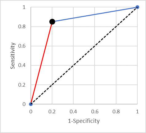
It is easy to prove that the area under the curve is equal to the average of the sensitivity and specificity (0.825 in the example). One can think of this average as a standardised accuracy – the accuracy when there are equal numbers of diseased and not-diseased individuals. Some readers may have heard of Youden’s J statistic (which is the sum of the sensitivity and the specificity minus one). Summarising a test’s performance by the average of its sensitivity and specificity is equivalent to using Youden’s J statistic.
Lines of equal negative predictive value (NPV)
It is useful to consider what happens as one moves along the straight line from a point in the ROC space to the top right-hand corner (the blue line in Figure 1). It is easy to show that a straight line that ends in the point (1,1) is a line of constant negative predictive value (NPV) (as Fermat might have said “I could scribble the proof in the margin”). This means that if you have a continuous test results and (from some point onwards) decreasing the threshold for positive results in such a straight line, then taking any threshold along that line will result in a test with the same negative predictive value.
Another way of thinking about this is that starting with the original cut-point (the lower left end of the line segment), moving along the (blue) line towards (1,1) one is doing no better (and no worse) than randomly calling “positive” some proportion of those currently called negative.
Lines of equal positive predictive value (PPV)
Similarly, one can show that the (red) line segment joining the bottom left-hand corner to the point of interest is a line of constant positive predictive value (PPV). And moving along it is equivalent to relabelling a random proportion of positives “negative”.
When is AUC more useful than Youden’s J statistic?
As we have seen, the AUC is equivalent to the average of the sensitivity and specificity of a dichotomous test. How should we interpret an AUC that is greater than the average of the sensitivity and specificity at the cut-point we plan to use?
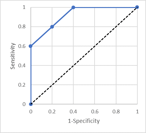
Consider Figure 2, the ROC curve goes straight up from (0,0) to (0,0.6), diagonally up to (0.4,1) and straight across to (1,1). On the line from (0,0.6) to (0.4,1) the mean of sensitivity and specificity is 0.80, but the AUC is 0.92. So, comparing the dichotomous test with sensitivity 0.80 and specificity 0.80 which has AUC of 0.80, this test has considerably greater AUC, but if one is going to set a single threshold for use, one cannot really improve things over the dichotomous test with AUC of 0.80!
How can we take advantage of a test with the ROC curve in Figure 2? One needs to use two different thresholds. One threshold gives a specificity of 100% but only 60% sensitivity – so anyone above that threshold can be referred for treatment. A second threshold gives 100% sensitivity but only 60% specificity. Individuals below the second threshold do not have disease and can be safely discharged. Note that between these two thresholds the test is performing no better than random – there is nothing to be gained by using a third threshold between these two values.
Multiple thresholds
The answer to the question as to when should one be interested in the fact that the AUC is greater than the average of the sensitivity and specificity should now be clear. It is useful when we can use two thresholds and manage people appropriately depending on whether their test result is lower than both, between the two or higher than both.
We should only consider a second threshold when it lies above the straight line connecting the current threshold to either the bottom left corner or the top right corner. Further thresholds need to lie above the line connecting the point to the left to the point to the right. The issue of adding more thresholds is whether the gain (in AUC, say) is justified by the complication of using multiple thresholds.
The bottom-line
If a paper makes a big thing about an AUC that is larger than the average of the sensitivity and specificity at the chosen threshold be suspicious and ask yourself how exactly would you manage multiple thresholds in order to take advantage of the additional information in the continuous biomarker. Similarly, the “improvement” of a new risk predictor with a slightly greater AUC than an existing one, may be non-existent if in practice one needs to dichotomise the predictor in order to manage patients.
The views expressed are those of the author. Posting of the blog does not signify that the Cancer Prevention Group endorse those views or opinions.
Share this page
![]()
Leave a Reply